Coloring Tutorials // Hardcore Basics // Basic Shading
June 22, 2025 by Ajey
We’re just going to go over basic shading to add some depth to our masterpieces. We’ll touch on stippling as an alternative, and how to use complementary colors to enhance the effect.
Choose your weapons:
- Alcohol markers — any brand will do. Use all the things.
- Paper that is bleedproof or at least marker friendly.
- Lineart. (Yours or mine ;*)
- Scrap sheet of the same paper as your lineart.
But why? Because I said so. Trust me — you’ll appreciate this step later. This is our swatch page and testing zone. It helps us judge how many layers we can apply before we overwork or bleed through our “canvas.” It’s also great for practicing effects.
Alright! Let’s get into it.
Step 1: Get your shit together
First, grab your supplies. I picked a few markers and will build out my palette as I go.
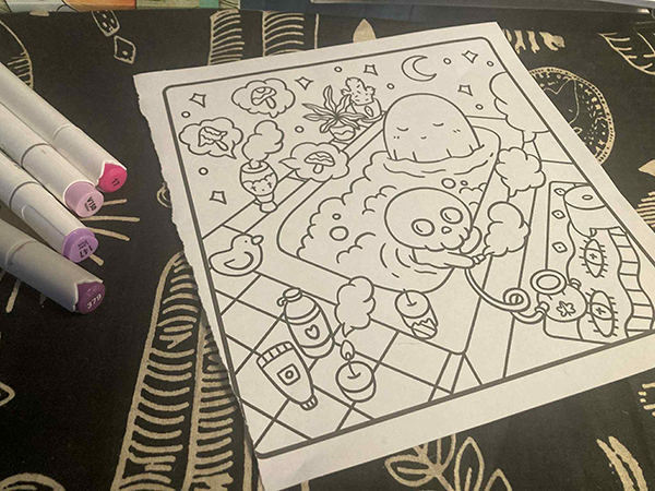
Book Used ♥ Markers Used: Ohuhu, Arrtx, & Shuttle Art
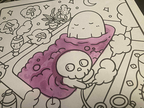
Step 2: Do your basic fills and add some thrills
Fill in your base areas with your chosen colors.
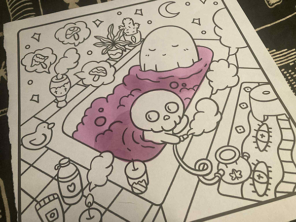
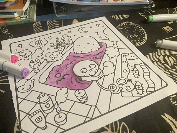
After your first layer dries, go back and deepen your shadows using the *same* color — this builds that dimensional vibe. If you like how it looks, cool! If not, keep building on it.
Want to add texture? Try stippling — it’s just dots layered to resemble shadow. Bonus: it’s great for masking mistakes 😎
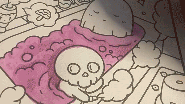
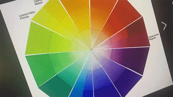
Alternate Option: Using the Complementary
Using complementary colors (opposites on the color wheel) can help cancel out harsh hues or correct shadow tones. It’s a slick way to add contrast and realism.
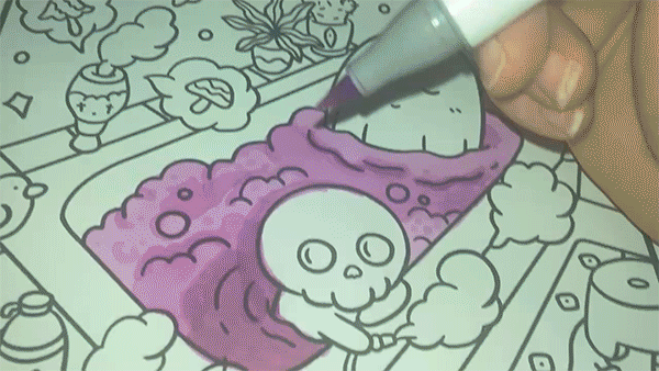
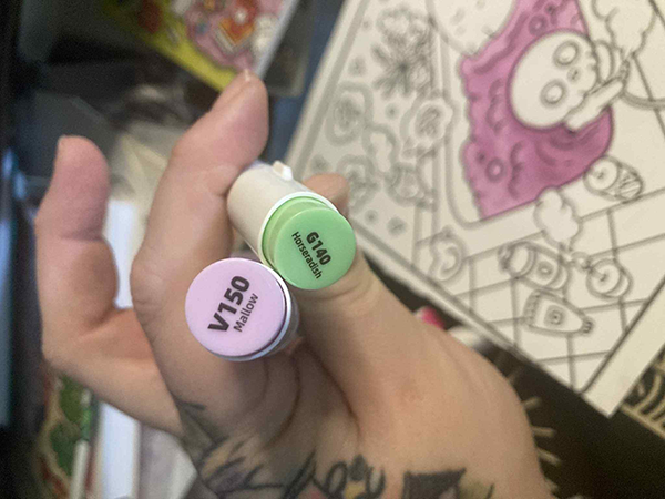
So if I’m shading in my purple area, I’ll be using green — in a similar value — to, well… shade. 🧪 It neutralizes the tone and adds depth without making it muddy.
It’ll look a little something like this. You can layer your complimentary the same way you would your original color.
 Welcome to Artopsy.net! I'm Amanda Jean or Ajey. However way you want to spin it and I'm here to share as much knowledge as I can. I mainly do written tutorials so I apologize if you prefer video. It's overstimulating for me personally to create them. Can't focus on the art if I'm spending half my time trying to film it >:[